Vartopia's rebrand injects an adventurous spirit into the traditionally flat IT Channel.
Technology meets lifestyle in the bustling IT channel market. With a brand that had grown worn and unreflective of its industry leadership, Vartopia sought a transformation. Our answer? A fresh, lifestyle-infused brand identity drawn from the founder’s passion for the outdoors that doesn’t forget the role they play in the IT channel.
Discover how a comprehensive brand strategy and a visually captivating identity propels Vartopia towards its next chapter.
Client
Vartopia
What we delivered
Brand strategy
Brand identity
Design system
Primary Font
Denim Ink WD
Website
vartopia.com


Brand Strategy
An extensive brand strategy workshop was conducted. The team at Vartopia was presented with three distinct strategic directions the brand could take, each crafted from the Creative Brief, research, and competitor analyses. Each option had a unique Brand Idea, Positioning, Purpose, and visual territories reflecting that strategy.
The winning brand strategy and territory, ‘The Pathfinders,’ stood out for its unique positioning of Vartopia as the reliable navigator—the trusted guide for navigating the complex IT landscape. This strategy inspired visuals that echoed the spirit of exploration and discovery.


But what does it mean?
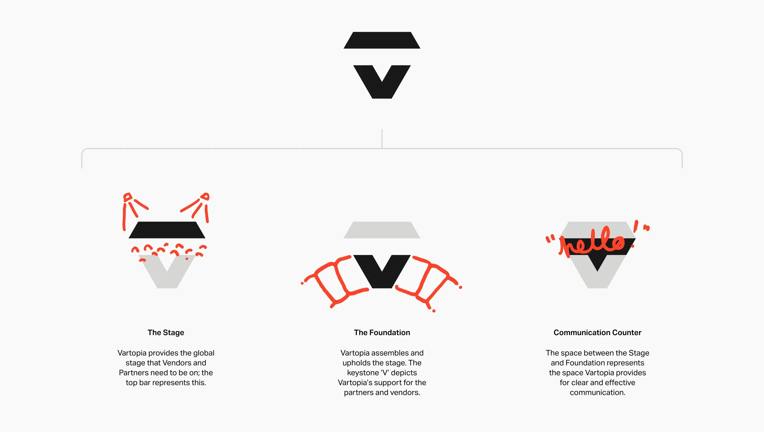
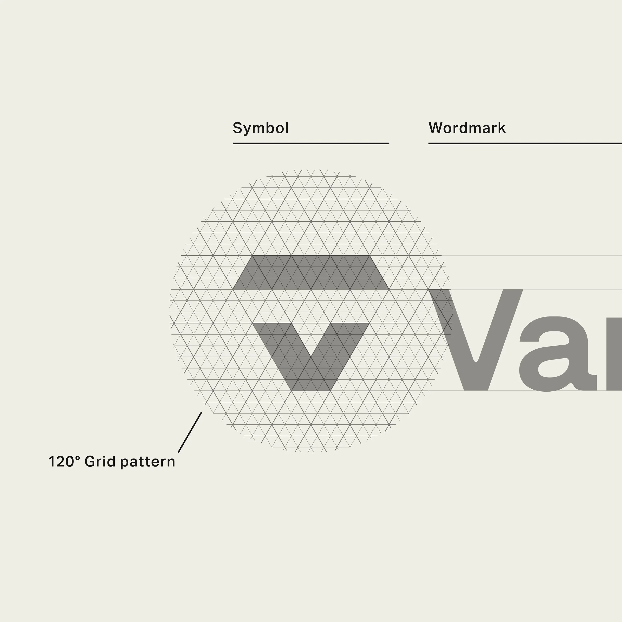
Vartopia’s weighty master logo comprises two parts: the Symbol and the Wordmark. Within the Symbol are the Stage and the Foundation, which embody Vartopia's two roles for its Partners and Vendors.

Pixel Photography
We developed a distinctive photography effect for Vartopia's team to use as a recognizable graphic device. The outdoor imagery and Vartopia's colour palette complemented the pixel photography style beautifully, resulting in some visually striking images.
By pairing specific colours from the palette, Vartopia could adjust the intensity of the pixel photography effect to meet the requirements of different applications.
Our Pixel Photography effect converts any image into a duo-colour texture.
Every pixel is two equilateral triangles (all three internal angles are congruent and each 60°) stacked, with the bottom being one colour and the top being another.
The pixels are then placed on an alternating grid, sitting at 120° angles from each other. Each pixel then changes its size to increase or decrease the density, and the image forms when viewed from a distance.


Vartopia icons
A family of icons was created using details found in the Denim, font used for the brand identity. Outer edges remain sharp while inner corners are rounded.


Julius indeed acted as our sherpa on this rebrand journey.
Our stakeholders, each with their unique and valuable ideas, were the driving force behind our brand's evolution. In his Brand Strategy workshop, Julius skillfully guided us in focusing these diverse ideas into one exciting direction we could all get behind. 'The Pathfinder' Brand Driver evolved visually into the exciting Vartopia brand we now have.
This new brand reflects who we are as a company and what we stand for.

Michael Reilly
CEO and Founder of Vartopia

Not your average swag
In keeping with the mountaineering spirit, a branded Trail-Mix we coined Trail-Blazer-Mix (Trailblazer... Pathfinders... Genius!) was designed to give away at trade shows and branded outdoor clothing ideas for team members.
