
A visual identity as empowering as the mission behind it
Ryka isn’t just a brand, it’s a movement committed to elevating women in the tech industry. From the outset, we knew the visual identity had to do more than look good. It had to embody the strength, fluidity and ambition of the women it represents. The challenge? Create a brand that could carry the weight of that mission with elegance and precision.

Client
Ryka
What was delivered
Brand identity
Brand system


The challenge
Ryka came to us with a clear purpose but no visual foundation. The goal was to design a brand identity, centred on a logo, that would speak to both the feminine energy behind the initiative and the technical rigour of its field. It needed to feel handcrafted yet capable. Subtle yet strong.


Symmetry meets soul
At the core of the brand is a custom wordmark. The letterforms are built with balanced symmetry and fluid curves, nodding to both the structure of code and the softness of flow. It’s a subtle duality — representing Ryka’s unique position at the intersection of tech and empowerment.
Every curve, counter and stroke was crafted to evoke intention and ease. The end result: a logo that holds its own in a boardroom, a Slack avatar or a speaking stage.


Thanks for making my vision, purpose and essence come to life through the design of Ryka. It captures the flow, ease and power of what we stand for and how I like to operate!
It makes me smile each time I see it 🙏🏼

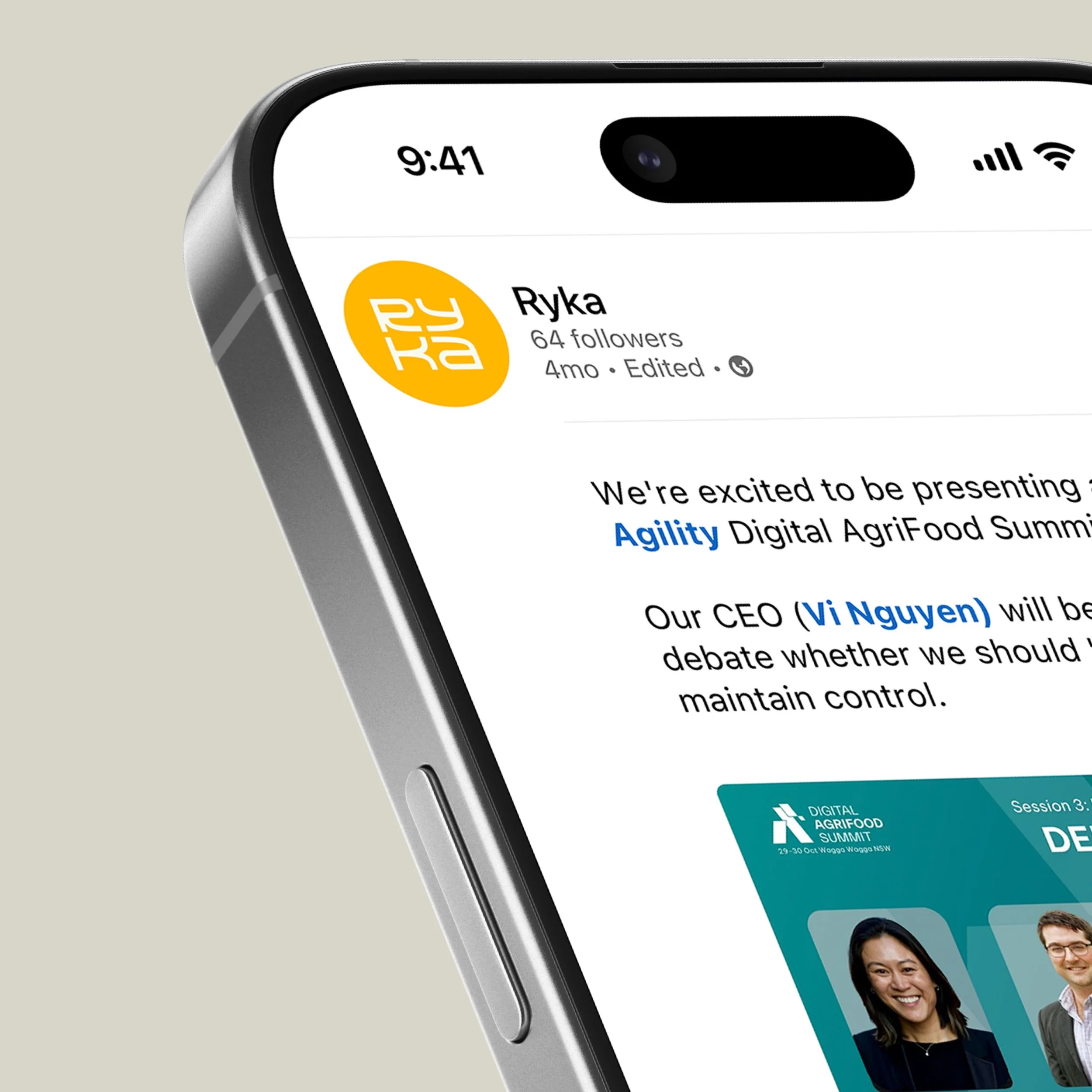
Vi Nguyen
Founder & CEO | Head of Product | Digital Executive | Ex-BCG | Ex-KPMG
Resonance and reaction
The identity has become more than just a logo. It’s a symbol of what Ryka stands for. The founder, Vi Nguyen, captured it best:
