
After building and selling two standout agencies, WiTH Collective and Accordant, Justin Hind, Dominique Hind and Steve Knowles came together to start something new. REUNION was created to break down silos and bring strategy, creativity, media, tech and customer experience into one seamless offering.
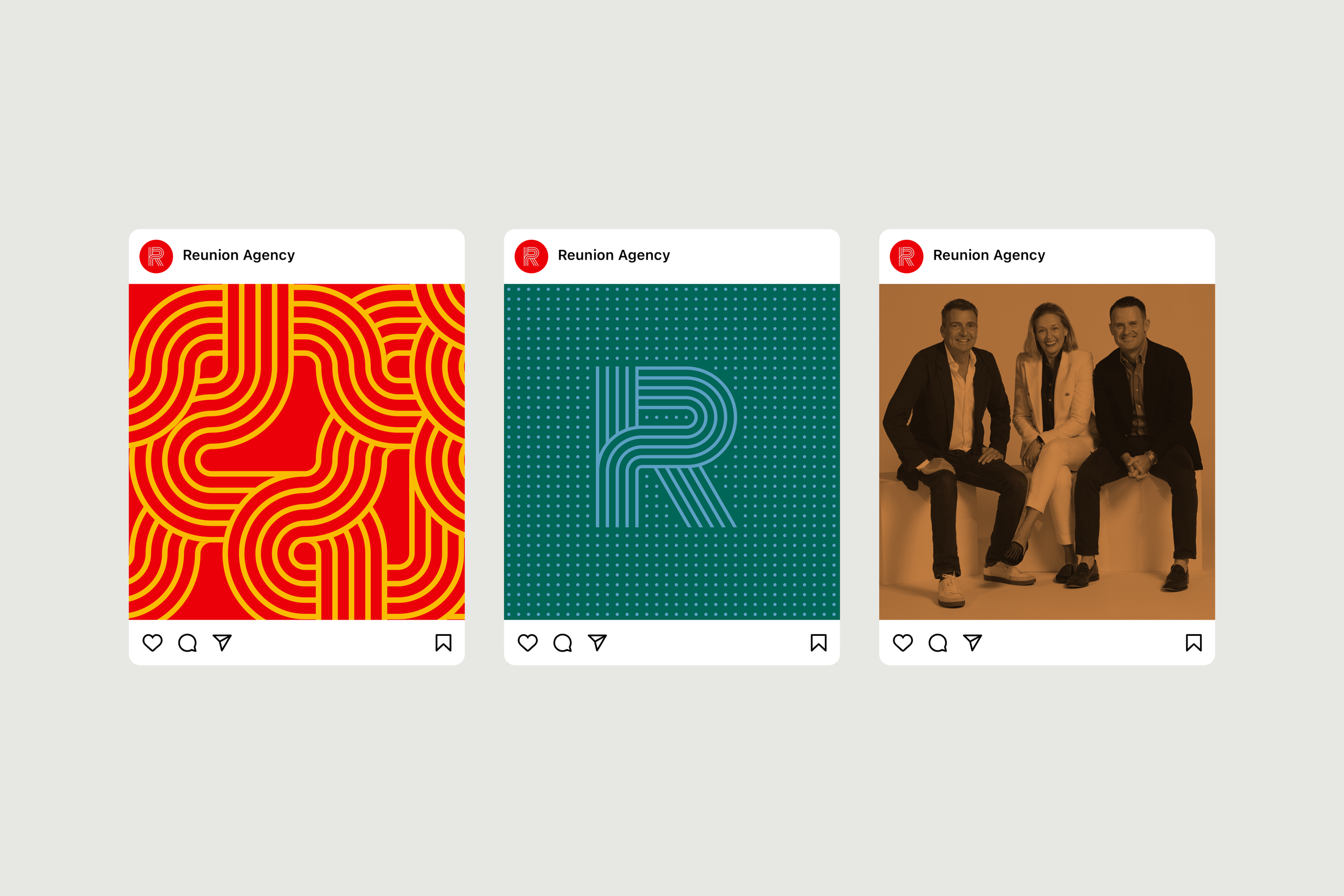
A placeholder identity got them through launch, but it lacked depth and cohesion. I was brought in to develop a full brand system from the ground up, one that could flex across channels, scale with the business, and clearly express REUNION’s integrated approach. This meant building a visual language that was both distinctive and strategic, with tools that could support everything from pitch decks to social content, and help the agency build early momentum with clarity and confidence.
Client
Reunion Agency
What was delivered
Brand identity
Brand system
Graphic devices

The REUNION Ribbon
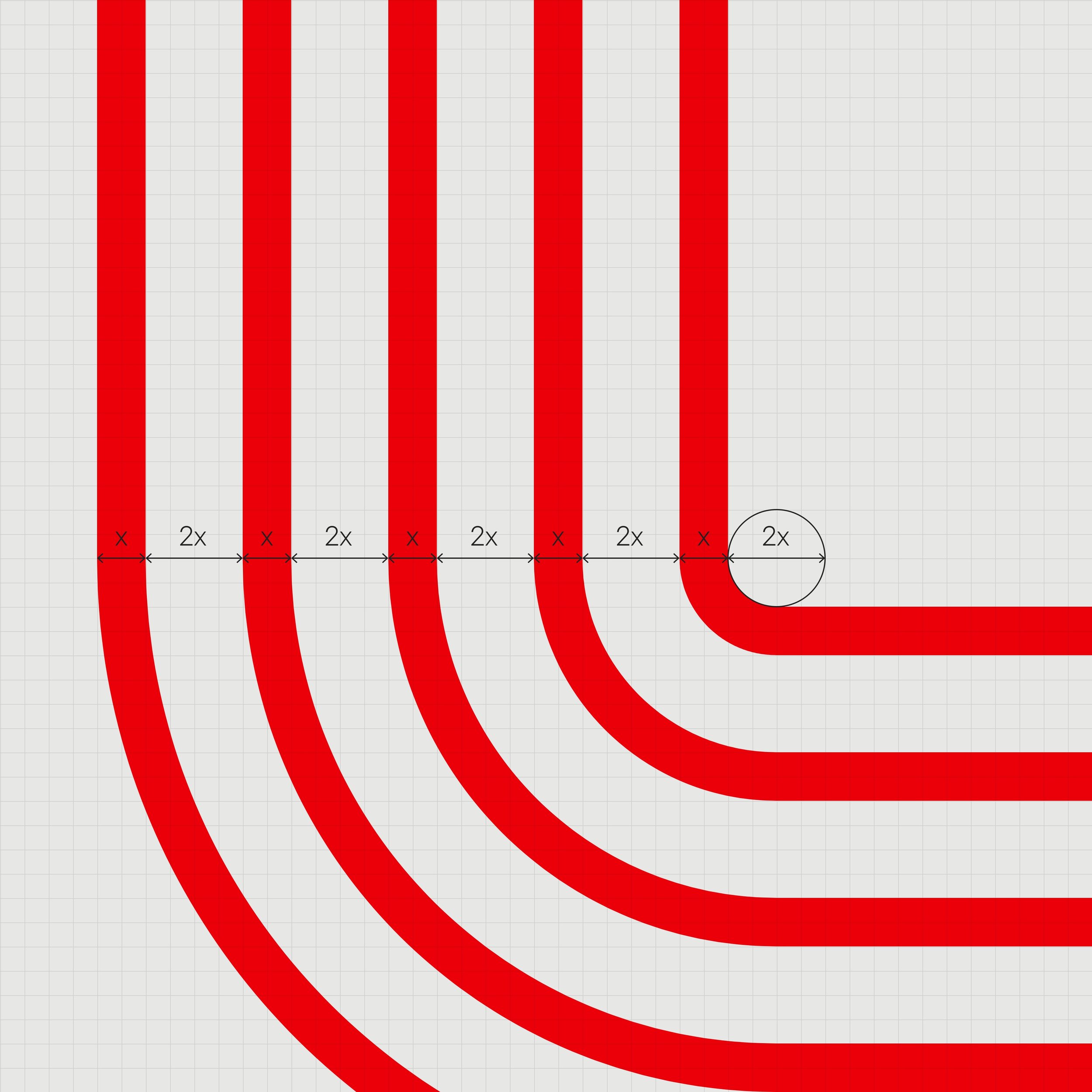
At the heart of the brand is the REUNION ribbon: a five-line mark that twists, folds and flows back on itself. This wasn’t just a logo, it quickly became a flexible graphic language.
Each ribbon line symbolises a core discipline: Strategy, Creative, Data, Media, Tech, intertwining into a single, seamless solution. This convergence is what makes REUNION unique: a place where formerly separate functions meet, collaborate and elevate one another.


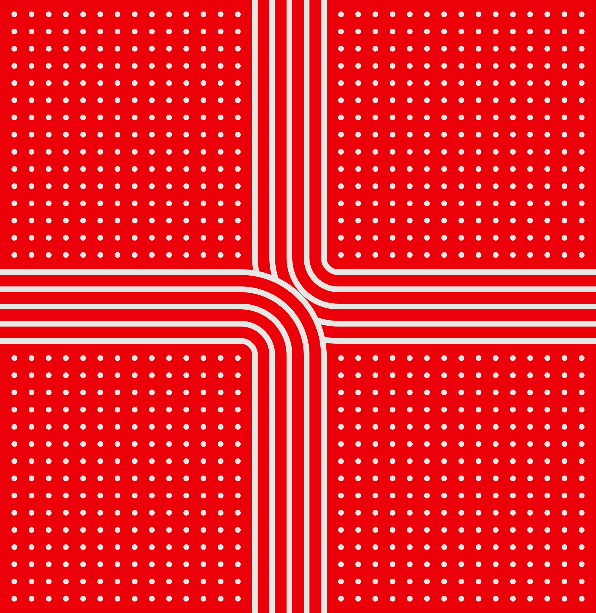
Playing the data field
REUNION’s positioning is rooted in the interplay between hard data and bold ideas. To reflect this, we designed visual moments where the flowing ribbon weaves through structured, grid-like fields, representing the analytical foundation that creative instinct dances through.
This tension between the fluid and the fixed became a defining aspect of the brand’s visual identity.


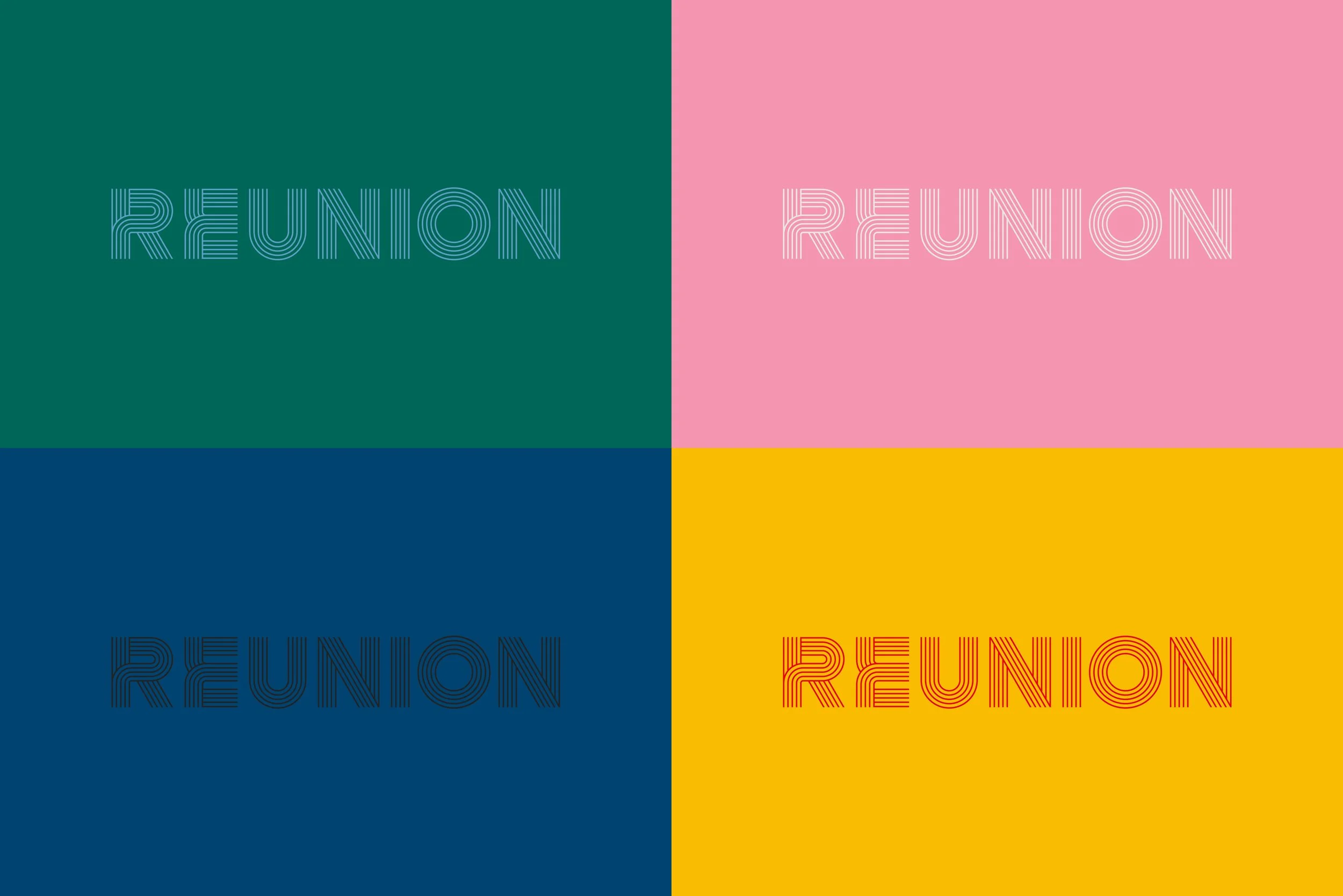
Colour with purpose (and a little swagger)
REUNION’s team is vibrant, opinionated, and full of personality. The brand needed a palette that could express that energy without losing clarity or control.
We built a bold yet versatile colour system designed to adapt, dialled up for pitches, dialled down for serious strategy decks. A complementary set of gradients was introduced, adding depth, movement and just the right amount of attitude.


A brand built to flex and flow
The final REUNION identity is a system, not a stamp. It’s expressive but structured, sophisticated but full of life, just like the agency it represents.
The ribbon lives not just as a logo, but as a narrative device, moving through data, across formats, and into conversations. It’s a reminder of the agency’s belief: that when you reunite great minds across disciplines, you get something greater than the sum of its parts.
